
Are you suffering with Special Cause Hallucinations?

A Quality Rebel reflection on variation, stories, and the discipline of understanding systems.
We hear a lot these days about hallucinations from AI large language models.
The warning is familiar: don’t blindly trust what the machine tells you. AI sometimes produces answers that sound convincing but are completely fabricated.
In medicine and psychology, we also understand hallucinations in a different way—perceiving something that isn’t actually there.
But there is another kind of hallucination that quietly appears in organisations every day.
Not clinical.
Not artificial.
Managerial.
And it often shows up when people look at data.
The Stories We Tell About Data
Anyone familiar with the teachings of W. Edwards Deming understands that variation is unavoidable. Every system produces variation as a natural consequence of how the system is designed and operated.
This is what we call common cause variation.
It is the background noise of a system.
To properly understand this variation, we need tools designed for the purpose. The most powerful—and most underused—is the Shewhart Control Chart, originally developed by Walter A. Shewhart.
Control charts allow us to distinguish between:
•	Common cause variation — the natural behaviour of a stable system
•	Special cause variation — signals that something unusual has occurred
Yet despite nearly a century of knowledge about statistical process control, many organisations still rely on a different approach.
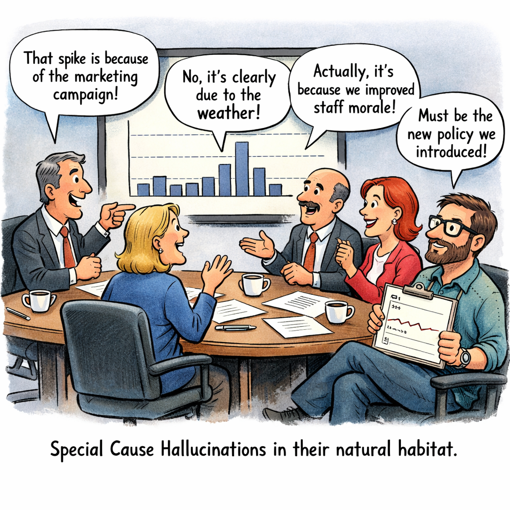
The management meeting narrative
A chart is presented in a management meeting—often a bar chart showing data month by month (if we're really lucky it might be hourly, daily or weekly, but that migh the wishful thinking).
Someone notices a number has gone up.
Or down.
Immediately, explanations begin to appear.
“That increase must be because of the holiday period.”
“The drop probably reflects staff being off sick.”
“That spike is likely due to the new policy we introduced.”
These explanations often sound plausible. They may come from people with considerable subject-matter expertise.
But plausibility is not evidence.
Without understanding the system’s variation, these explanations are often nothing more than stories.
And sometimes those stories are hallucinations.
The Special Cause Hallucination
A special cause hallucination occurs when we believe we have identified a special cause in the data when, in fact, the variation is simply part of the system. Dr Deming classified this as the first mistake when looking at data variation.
In other words:
We see a signal where none exists.
Humans are naturally pattern-seeking creatures. Our brains are wired to detect meaning in changes, even when those changes are simply random variation.
In organisational settings, this tendency is amplified by pressure to explain results quickly.
Leaders feel compelled to interpret every movement in the data.
Managers feel expected to offer reasons.
Analysts feel obliged to provide explanations.
But when the data is part of a stable system, these explanations are often fiction disguised as insight.
A Practical Example
Imagine a management meeting reviewing the number of taxi rides taken by a company each month.
The data is presented as a bar chart showing monthly totals.
Someone notices that October’s value is higher than September’s. 900 more, must be signficant (did somebody calculate the p-value?).
An explanation quickly emerges:
“That must be because of the long bank holiday—more people travelling to the airport.”
It sounds reasonable. It may even align with someone’s experience or intuition.
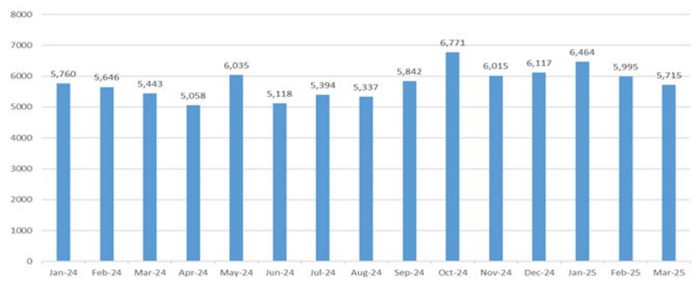
At first glance, the increase seems meaningful.
But let’s pause. What if we analyse the same data using a control chart?
But now we plot the same data on a Shewhart Control Chart.
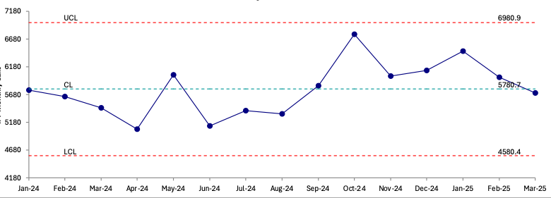
When the data is viewed properly, something important becomes clear.
The October value lies within the control limits.
It behaves exactly as the system has behaved before.
There is no signal.
Only normal variation. A Special Cause Hallucination, ascribing meaning or special cause to a data point in a system under statistical control!
The explanation about the bank holiday was not supported by evidence in the data. It was simply an example of a special cause hallucination—imagining a special cause when there is only common cause variation.
Why Special Cause Hallucinations Matter
At first glance, this may seem harmless. After all, what damage can a plausible explanation do?
Unfortunately, quite a lot.
When organisations hallucinate special causes, two damaging behaviours often follow.
- Tampering with Stable Systems
When leaders react to every fluctuation as if it represents a meaningful change, they often introduce interventions that make the system worse.
This phenomenon was famously illustrated by Deming in the funnel experiment (created by Lloyd S. Nelson), where reacting to random variation increased variability rather than reducing it.
- Distracting Attention from the System
When the focus is placed on explaining individual data points, the deeper question is ignored:
How does the system itself perform?
Improvement comes from understanding and improving the system—not from inventing explanations for every data point that moves up or down.
The Discipline of Not Explaining Everything
One of the most difficult disciplines in management is learning not to explain every change in the data. Or seeming to do nothing (Rule 1 in The Funnel Experiment).
This can feel uncomfortable.
Leaders are expected to have answers. Analysts are expected to interpret results. Organisations reward confident explanations.
But the most honest response to many data points is simply:
“This appears to be normal system variation.”
Recognising that reality is not weakness.
It is statistical maturity.
A Quality Rebel Reflection
Perhaps the real hallucination problem in modern organisations is not caused by artificial intelligence.
It is caused by our own desire to explain everything we see and be the hero taking action to improve things.
The truth is that most variation in organisational data is not special.
It is systemic.
And the path to improvement begins not with storytelling, but with understanding variation.
As Deming reminded us decades ago, the first step in improvement is learning to see the system clearly.
Control charts help us do exactly that.
They help us separate signal from noise.
And they protect us from one of management’s most persistent illusions:
the special cause hallucination!
Reference
Deming WE. The New Economics for Industry, Government, Education. 2nd ed. Cambridge (MA): MIT Press; 2000.